ABOUT US "Advertising agency that offers branding solutions and produces creative art projects."

Operating in the advertising sector for more than 30 years, Düşgen AD/ART team produces original projects in the field of advertising and art. Our primary service area in advertising is to create a new brand image or reconstruct the visual identity of the existing brand within the framework of the strategy we have developed specifically for each customer.

Another work field of Düşgen AD/ART, which visually reconstructs many brands in the national and international arena, is to bring an artistic identity to institutions and to increase the brand identity to a more prestigious level with the branding services it provides in the field of visual communication and the projects it has created with the power of modern art.

ABOUT US
"Advertising agency that offers branding solutions and produces creative art projects."
Operating in the advertising sector for more than 30 years, Düşgen AD/ART team produces original projects in the field of advertising and art. Our primary service area in advertising is to create a new brand image or reconstruct the visual identity of the existing brand within the framework of the strategy we have developed specifically for each customer.

Another work field of Düşgen AD/ART, which visually reconstructs many brands in the national and international arena, is to bring an artistic identity to institutions and to increase the brand identity to a more prestigious level with the branding services it provides in the field of visual communication and the projects it has created with the power of modern art.
WHAT WE DO?
LOGOTYPE DESIGN
The logotype design, which is the most important element in the visual communication of the brand, is the main symbol of that institution before the target audience. With the awareness of this importance, we design a memorable "visual signature" that will express the brands we work with and their service areas to the customer base in the shortest and fastest way.
logo-tasarimi
kurumsal-kimlik
CORPORATE IDENTITY GUIDE
After creating a new Logotype design, we create a corporate identity guide in which all the visual elements of the institution are designed according to the new brand identity in order to complete the correct presentation of the company to its target audience and to maintain the sustainability of visual communication.
PREMIUM PROJECTS
While art stands out in today's communication and trade world as a prestigious way to emphasize brand awareness, supporting the corporate image with a correct artistic identity adds superior value to the brand. With the art-brand collaborations we carry out with this vision, we bring the visual communication materials of the institution to a premium value with the original forms of modern calligraphy.
premium-eser
sari-parca4
PROJECTS
All Projects
BRANDS
What We Did?
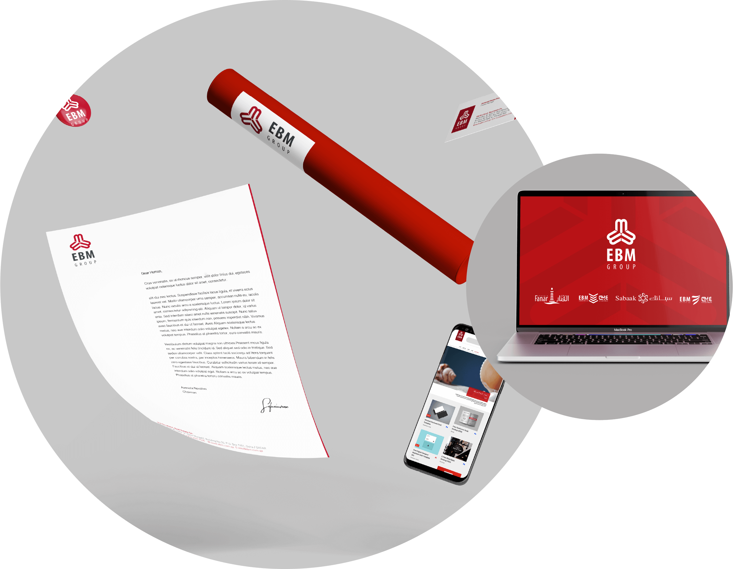
Brand: EBM GROUP
Sector: Service, Cons. & Tourism
Topic: Brand Identity
Year: 2017
What We Did?
Brand: Governship of Zonguldak
Sector: Gov. Organization
Topic: Brand Identity
Year: 2020
What We Did?
Brand: Turkish Airlines
Sector: Aerospace
Topic: Premium Project
Year: 2012-2019
What We Did?
Brand: IGA: Istanbul Airport
Sector: Aerospace
Topic: Premium Project
Year: 2018-2020
What We Did?
Brand: Gimaş Ship & Supply Serv.
Sector: Service
Topic: Brand Identity
Year: 2010
What We Did?
Brand: The College Of Asfa
Sector: Education
Topic: Brand Identity & Printed Works
Year: 2010
What We Did?
Brand: Yıldız Entegre
Sector: Industry
Topic: Premium Project
Year: 2021
What We Did?
Brand: Dentur Avrasya
Sector: Transport Services
Topic: Logotype Design
Year: 1999
What We Did?
Brand: Deniz Feneri Foundation
Sector: Non. Gov. Organization
Topic: Brand Identity
Year: 2020
What We Did?
Brand: Turkish Aerospace
Sector: Aerospace
Topic: Premium Project
Year: 2018-2021
All Brands
BLOG
"Ministry of Family and Social Policies Renewed Its Corporate Identity"
Ministry of Family and Social Policies, when it was established in 2013 as one of Turkey’s 13 ministries, did not have a visual identity. As the agency...
Read more
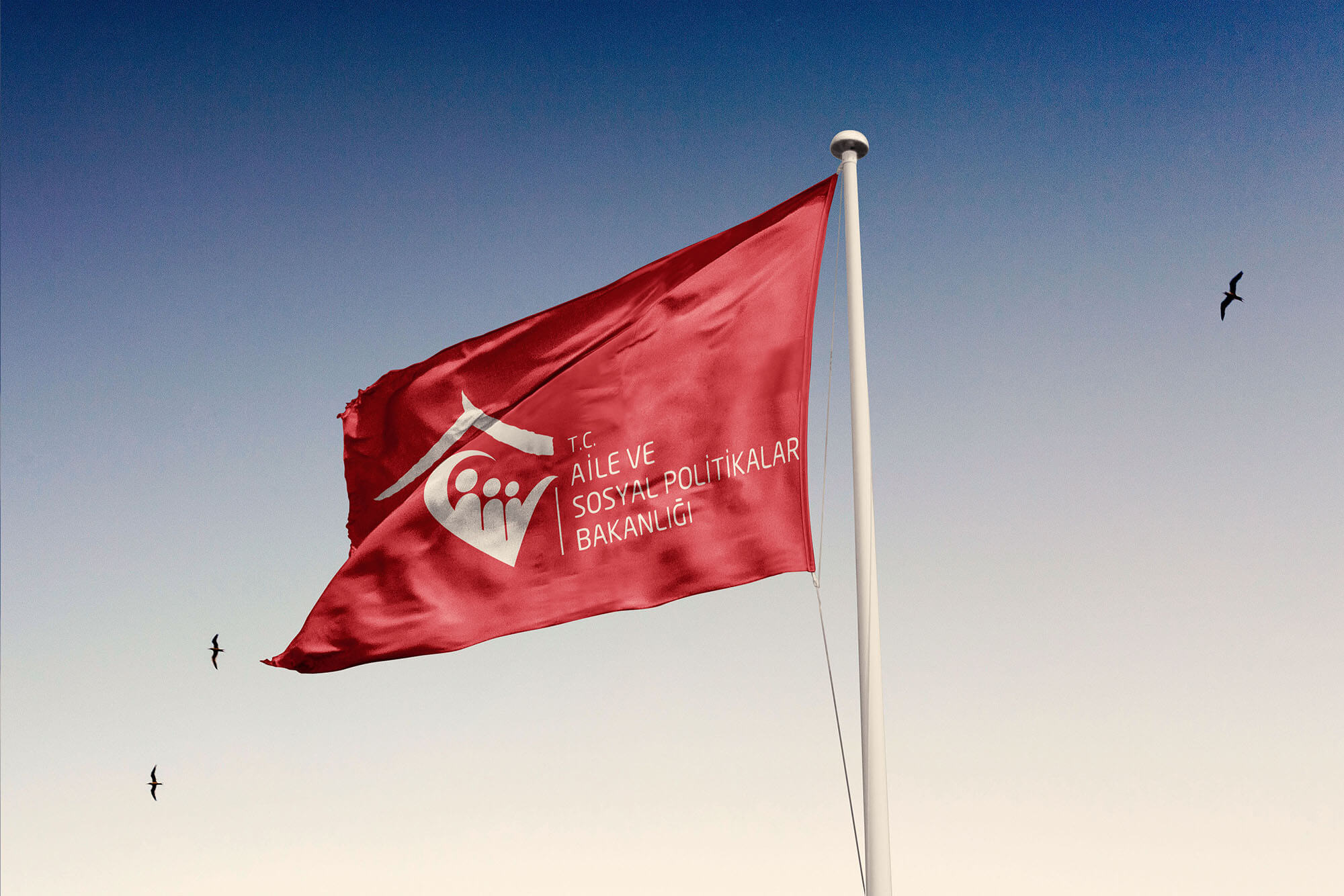
"Ministry of Family and Social Policies Renewed Its Corporate Identity" Ministry of Family and Social Policies, when it was established in 2013 as one of Turkey’s 13 ministries, did not have a visual identity. As the agency, we defined what corporate identity strategy should be followed for this institution, and determined the three main concepts that the Ministry management wants to express in the logo design as our starting point. The work we conducted upon the request of highlighting “Love, affection and family” in the logotype, which are the main features that express the institution, became the only visual identity file that was approved at the first meeting after it was submitted to the Ministry.

In this logotype, where we try to express the working culture of the Ministry in the shortest and clearest way, a font based on simplicity and legibility was used in order to perceive the institution quickly. The "red" chosen as the color was preferred in order to clearly perceive this logotype, which is the signature of the Ministry. In the expression of the brand name with its black color, it was aimed to provide the expression of the Ministry authority through the name of the institution and to be a tone that would contribute to the dynamism of the main color red.

While designing the logotype, it can be said that the process that developed over the question "How can we express the institution clearly at first sight?”, reinforced the idea of ​​expressing all three elements of the Ministry, defined as "love, affection and family" at the same time. The roof on the upper part of the logo was designed as a graphic element describing the institution of "family." The lines on the lower part resembling a heart figure were highlighted as a symbol of "compassion and love" with the human figures it contains. Also, the human-like design was placed in different sizes and separate expressions of the concepts of mother, father and child were provided in the logotype.

"The New Corporate Identity of Ebm Group and its 4 Sub-Brands Has Been Launched"
EBM Group, which was established in 1977 under the name of "Eid Bin Mohammed Al Thani & Sons", has become...
Read more
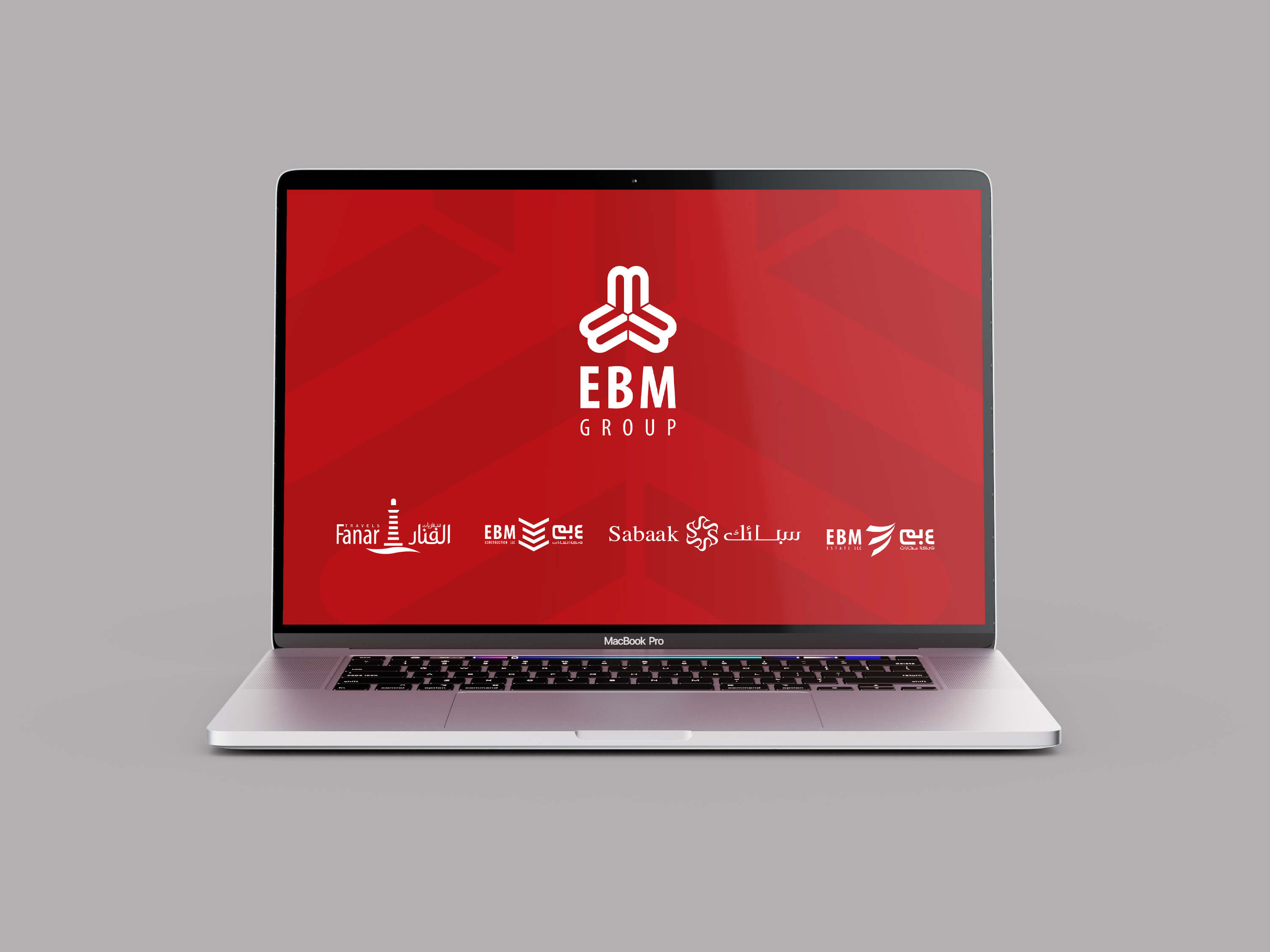
“The New Corporate Identity of Ebm Group and its 4 Sub-Brands Has Been Launched” EBM Group, which was established in 1977 under the name of “Eid Bin Mohammed Al Thani & Sons”, has become one of the leading Group companies of Qatar in 40 years with its activities in different fields. The visual identity work we have done for EBM Group, which operates in real estate, trade, jewelry and tourism sectors, was planned as a main corporate identity guide of the brand and 4 separate mini visual identities belonging to subsidiaries.

In the Logotype file prepared for the “EBM Group” corporate identity guide, our main goal was to express the brand name clearly and strongly. By placing the emblem on the upper part and the logo on the lower part in a balanced manner, we have achieved a seated corporate perception. The visual in the emblem was designed as a comprehensive study that expresses the letters E, B&M, which is the brand name, as well as including a contemporary expression with its lines. The brand name at the bottom of this emblem, which contains the letters containing the brand name from left to right, is placed in a prominent size. The group expression was placed at the bottom of the design with a smaller font.

One of the EBM's sub-brand "EBM Real Estate”, is a company offering exclusive real estate services in the international arena, including Turkey, Qatar, and theUK. In the logotype we did for brand, we used Latin and Arabic letters together in the emblem. We have placed the brand name in English on the left and Arabic on the right, and placed a contemporary and dynamic-looking emblem design in the middle. Thus, a visual signature that can be clearly understood in the national and international arena was given to the "EBM Real Estate" brand. While the gray we prefer in the font is preferred because it creates a strong real estate brand perception that is compatible with the main brand; In emblem red, it was aimed to reflect a dynamic company image and harmony with EBM Group.

In the visual identity we made for "EBM Trading & Contracting", another sub-brand of the group and providing services in areas such as project development, design and engineering, the emblem visual was created with a completely new line, parallel to the hard and progressive structure of the construction industry. In the logotype design, adhering to the font structure of the other sub-brand, only the blue color suitable for the sector and evoking power & upright stance was used. The emblem, in which the names of institutions in English and Arabic are featured at the same time, has gained a contemporary and understandable format in national and international settings.

We also designed the visual identity for the brand "Fanar Travel", which joined the EBM Group in 2007 and operates in the field of tourism, similar to other sub-brands of the EBM Group, including the name of the institution in English and Arabic. We benefited from the relaxing effect of the “gray” tone in the Logotype, in which elegant and blunt fonts are used for the travel and tourism industry. In the middle of the logo with soft lines, we placed a lantern design with a unique graphic form as an emblem. Thus, we brought the brand name together with the target audience visually.

Sabaak Co., which has been serving in the field of jewelry since 2013, was another brand that we created a corporate identity guide as the 4th sub-brand of EBM Group. The Logotype we prepared for Sabaak, which brings its products to its customers in Doha, the capital of Qatar, was created by using the English and Arabic names of the brand together. In the logo, which has elegant lines and prepared with a calm blue, a visual image suitable for the weight and elegance of the jewelry industry was preferred. In the emblem design, the initial letter of the brand, S, was repeated six times and intertwined, and in the resulting aesthetic design, golden yellow, the main product of the brand, was preferred.

"Zonguldak Governorship Has Its New Corporate Face"
The Governorship of Zonguldak, one of the first provinces of the Republic of Turkey, has a new corporate identity, reimagined by Düşgen AD/ART. In the visual identity...
Read more
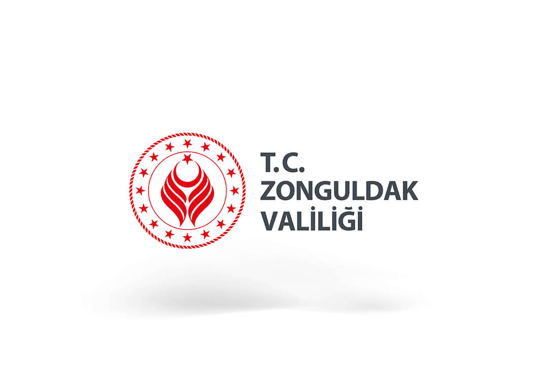
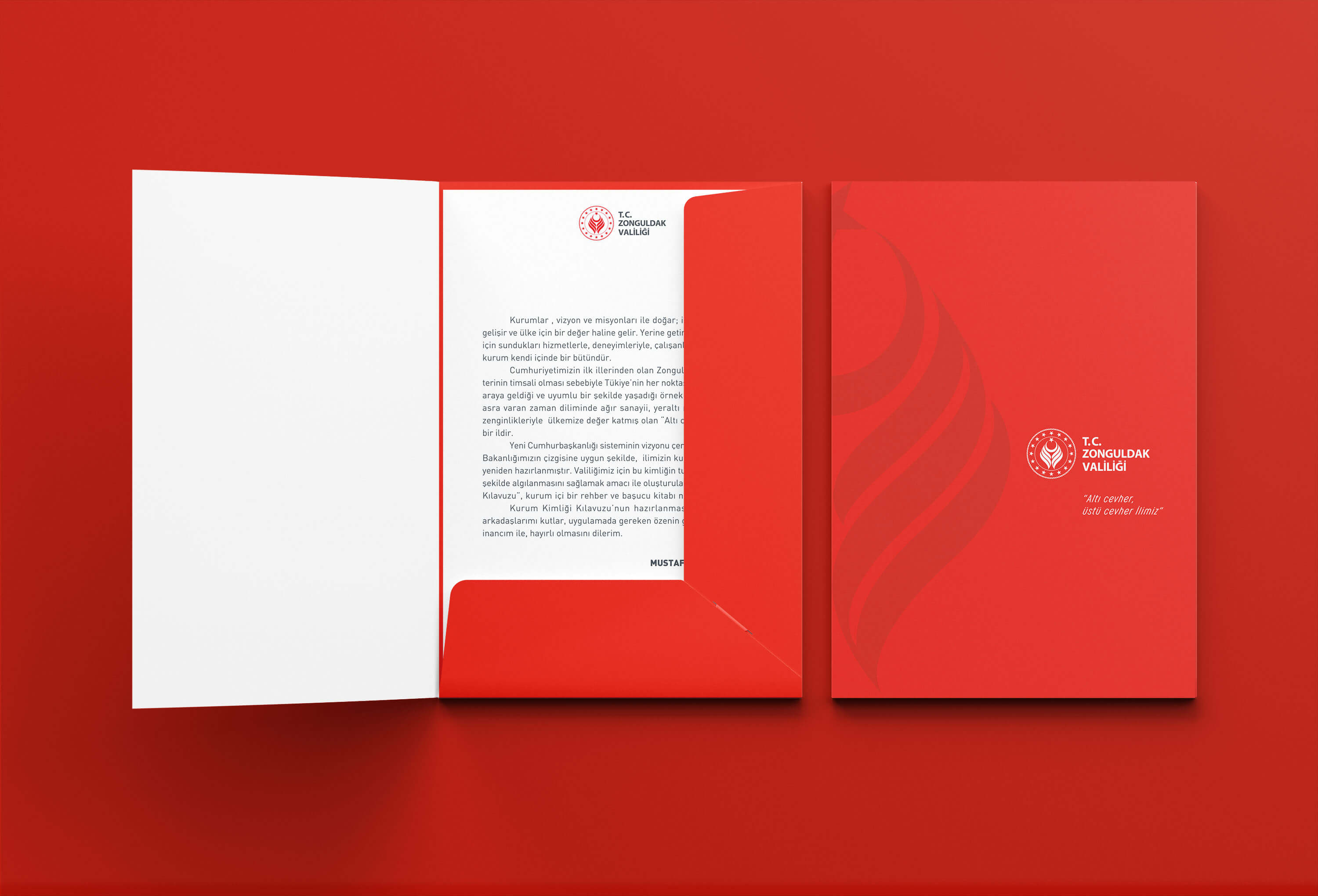
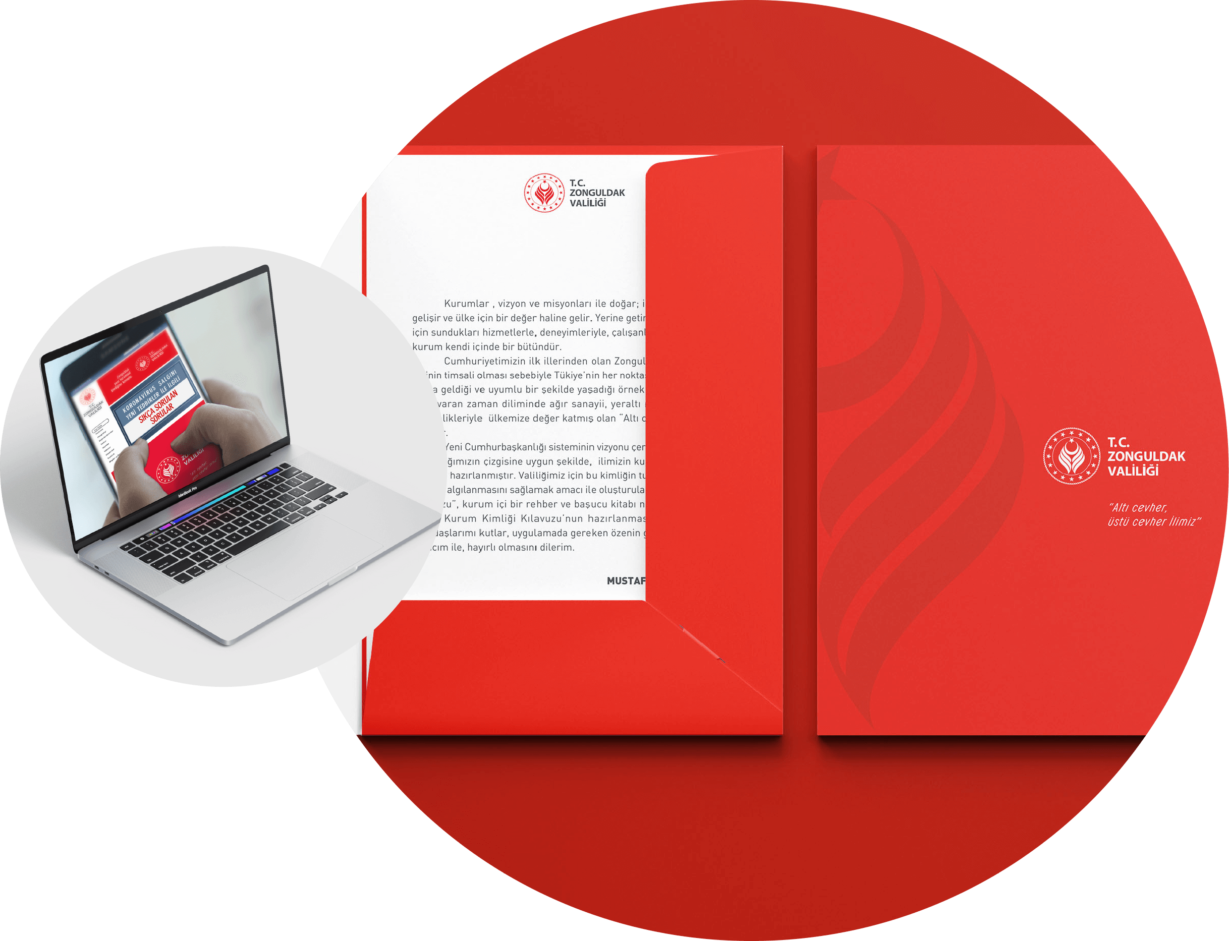
“Zonguldak Governorship Has Its New Corporate Face” The Governorship of Zonguldak, one of the first provinces of the Republic of Turkey, has a new corporate identity, reimagined by Düşgen AD/ART. In the visual identity file prepared in accordance with the brand dynamics of the governorship, it was aimed to express the institution in full integrity. New corporate identity, was created in a visual harmony with the Turkish Presidency. According to the standards set for all governorships, we have included 16 stars, symbolizing 16 independent Turkish states in history, around the emblem design for the Governorship.

We used the "Z", which is the initial letter of Zonguldak province, in an elegant interpretation in the emblem design. This line we created was created by rotating the letter Z 90 degrees and positioning it in two mutually. With this description, we expressed that Zonguldak is a "city of labor". Upper middle part "Moon and Stars" we put the visual and thus, we told Zonguldak human labor and effort by Turkey in a province where the service message.

We have organized the brand name by the standards of the Ministry and locating another circle into the circle of 16 stars, we put the phrase "Republic of Turkey Zonguldak Governorship”.

“With the "red" used as the main color in the Corporate Identity guide, we emphasized the strong position, national stance and dynamic energy of the Governorship. We used green, blue and gray tones as auxiliary colors. With its green color, we symbolized the natural beauty of the city of Zonguldak. We explained "coal", one of the main symbols of the city, in gray. We emphasized that the province of Zonguldak is surrounded by the sea with blue, which is another auxiliary color value we use.

"Vakif Participation Bank Art Project"
In collaboration with Vakıf Participation x Bilal Akkaya, another of the premium projects we have created based on the prestige that art adds to the brand, the brand logotype...
Read more
+
“Vakif Participation Bank Art Project” “Transforming Vakıf Katılım Logotype into an Artwork and Exhibiting at the Entrances of All Branches”
In collaboration with Vakıf Participation x Bilal Akkaya, another of the premium projects we have created based on the prestige that art adds to the brand, the brand logotype was reinterpreted with calligraphy, in line with the brand's story, in the format of a waqf (foundation) prayer and transformed into an original artwork. Artist Akkaya created this master piece using 24 carat gold dust.

After the main work was revealed, the Turkish format of the Foundation prayer, in line with the brand story, was put in a special area created at the entrance of the central building and all branches of the bank. In addition, the Foundation prayer design in the form of the Vakıf Participation Bank logotype, designed by Akkaya, was placed in the middle of this special area, and the artwork was used as an instrument in the original and prestigious expression of the brand. The creation of similar areas in different branches has come to the fore as an important point that enables the brand's investment in art to be consolidated in the eyes of customers and business partners, and also brings together the brand's artistic story with real life.

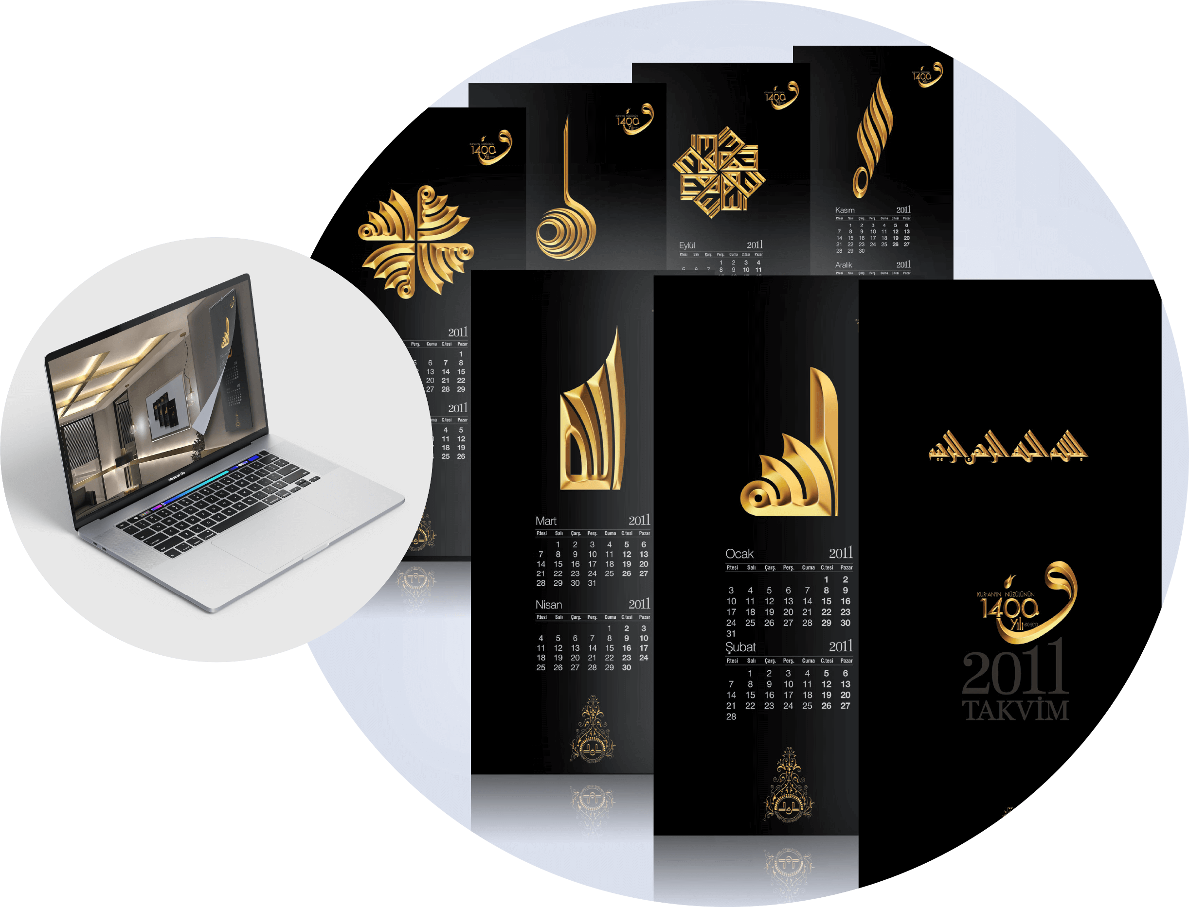
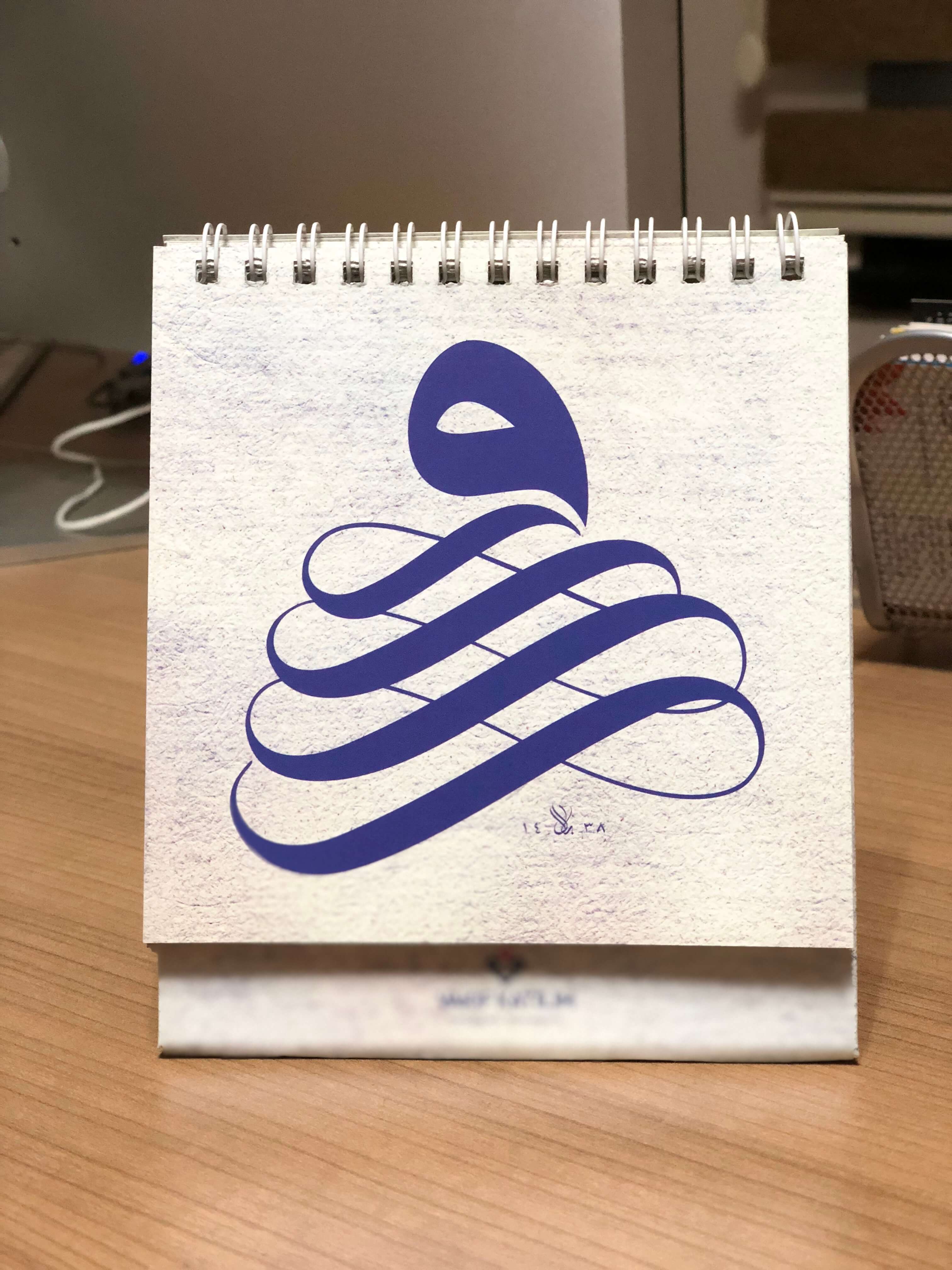
“Premium Calendar Consisting of 12 Modern Letter Vav Designs”
Another premium project created by Akkaya in collaboration with Vakıf Participation was the 2017 calendar design done with a modern calligraphy collection consisting of 12 different lines of Vav letters. In accordance with the visual identity of the brand, Akkaya’s original works were designed aesthetically by Düşgen AD/ART. The strong and prestigious stance of the existing corporate image was reinforced by using blue as color, one of the corporate color values ​​of Vakıf Participation.

"Turkish Aerospace Art Project"
Providing visual communication services to brands, Düşgen AD/ART is signing important brand-art collaborations with premium projects prepared using modern calligraphy...
Read more
"Turkish Aerospace Art Project" “Interpretation of TAI Logotype with Modern Calligraphy & TAI Art Collection”
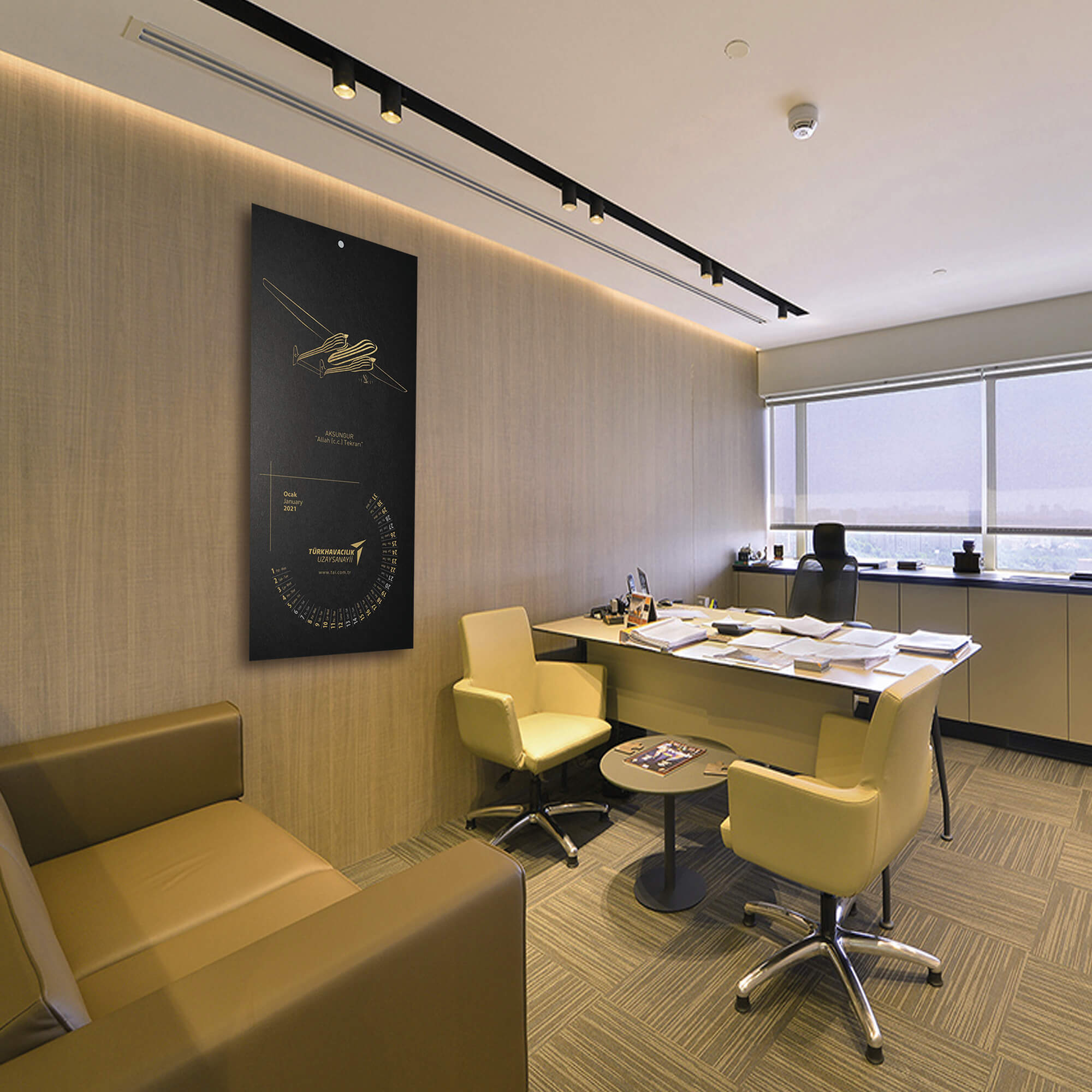
Providing visual communication services to brands, Düşgen AD/ART is signing important brand-art collaborations with premium projects prepared using modern calligraphy art collection of agency president artist Bilal Akkaya. Akkaya, first, had interpreted an aircraft with calligraphy, belonging to the corporation of the request of Turkish Aerospace. In the next stage, within the framework of the project file created by Düşgen AD/ART, 15 aircrafts and logotype of the brand were transformed into artworks with a modern perspective of calligraphy. A modern calligraphy collection consisting of 16 works in total was brought to Turkish Aerospace. These works are exhibited in the art gallery located in the headquarters of TAI.

"Premium Calendar Project"
An annual calendar design consisting of the visuals of 12 works, prepared by Bilal Akkaya, was created as the modern art collection for TAI, with the aim of reaching a wider audience and increasing the brand prestige. This premium calendar is designed in two sizes, for wall and table. A premium package with a calendar design in both sizes and a special note card was presented to the business partners of TAI.

"Turkiye Finance Bank Premium Calendar Composed of Original Calligraphy Designs"
In 2012, a premium project was prepared for Turkey Finance Participation Bank by Düşgen AD/ART and...
Read more
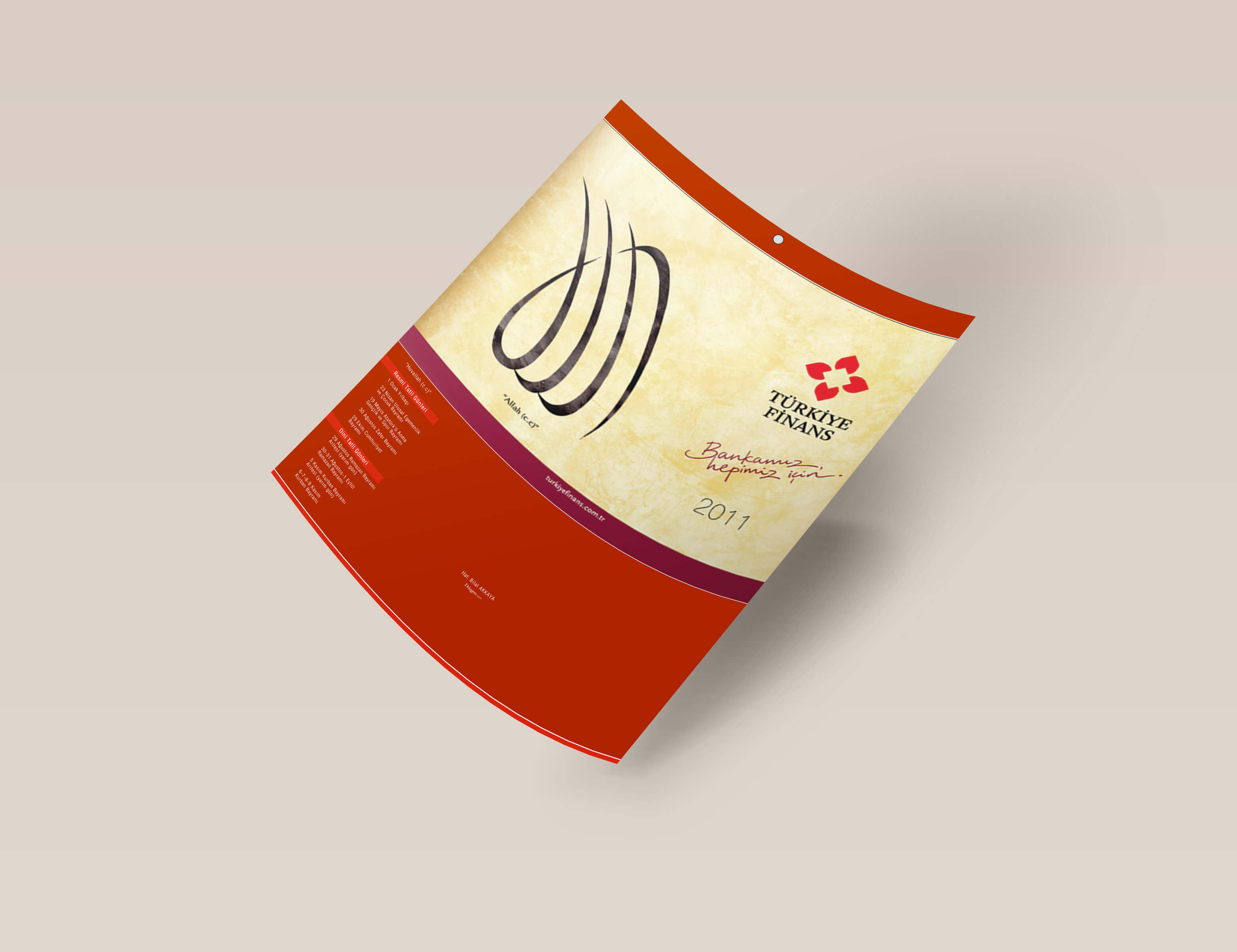
"Turkiye Finance Bank Premium Calendar Composed of Original Calligraphy Designs" In 2012, a premium project was prepared for Turkey Finance Participation Bank by Düşgen AD/ART and in this project, 6 original modern calligraphy designs were used in the brand's annual calendar. With this aesthetic work, a contemporary form of art met with Turkiye Finance’s customers and business partners. Added to that, artworks within the project, reaching the top rate appreciation, became known in public with the expression of “Turkey Finance Calendar”. The brand used this calendar enriched with art content for only one year, 2012. These artwork designs continue to be included in the collection of artist Akkaya.

CONTACT